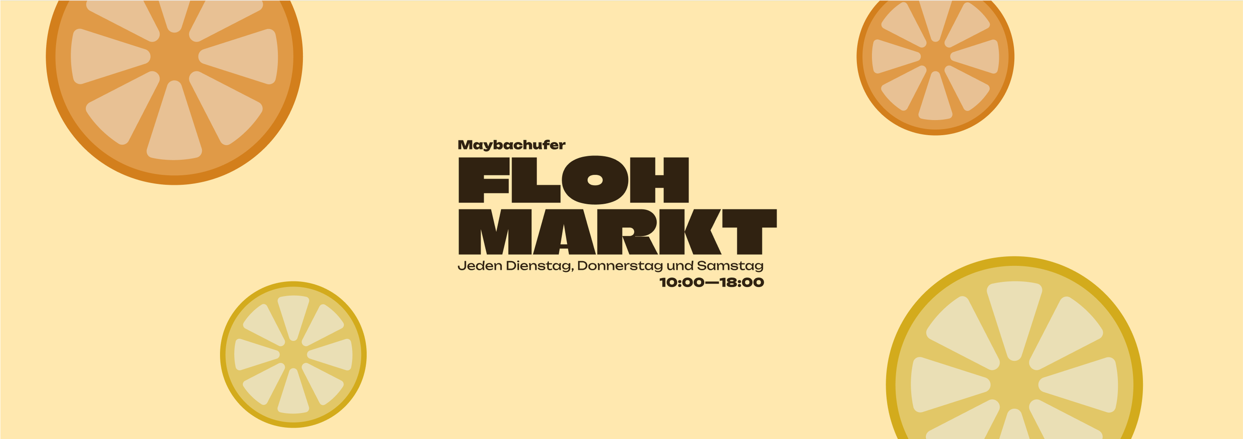
Maybachufer Floh Markt
Brand Identity / Print Assets / Just for fun
Maybachufer Market is my favourite market in Berlin. This is a just for fun task, which I sometimes like to do to keep myself up to date with current trends and explore different visual approaches. I love finding an opportunity to explore different typefaces and combine text and image to create a specific mood. For this quick project, I let the typeface rule. I started by finding two typeface pairings and imagining how they could look combined with other visuals. I’ve added 2 super short screen recordings so you can see a little glimpse of how my brain works, too!
Here, I knew I wanted to experiment with the typeface ‘Climate Crisis’. I took a few minutes deciding which typeface could compliment it and how I wanted the text to be composed. This is also time to experiment with line heights and capitals - whilst doing this, I’m thinking about my next steps; what colours will go well with these? What kind of vibe am I getting from this typeface design?
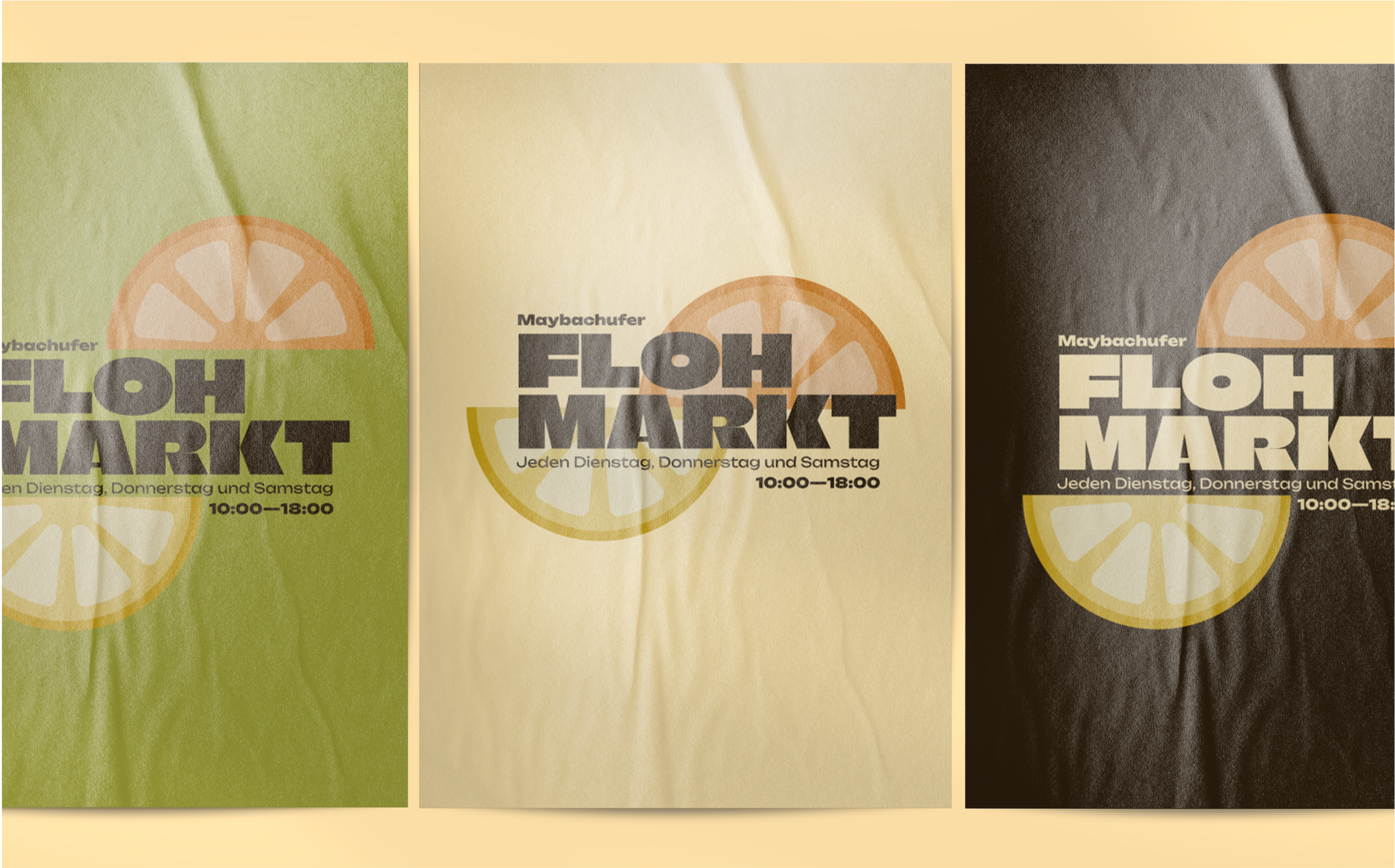
Colour helps me to visualise additional next steps. Whilst placing the colour, I start to think, ‘this has a 70s vibe’. I started picking saturated colours to experiment with the look and feel - shortly after this, I started diving into visual assets (see below).


